The importance of the user experience

When it first came out in 1979, I desperately wanted a BIG TRAK toy tank. Not only did it look like a spaceship on six wheels that had come straight out of Battlestar Galactica (the tank bears more than a passing resemblance to the famous spacecraft of the original TV series that first aired in 1978), it was a programmable computer at a time when only NASA scientists had access to them.
I never got one. But a friend did. And you can imagine my excitement at finally getting my hands on it and playing with the programmable features. After all, the TV advert of the time really sold it well:
Practically self-autonomous and programmed to your commands in an instant!
Except it wasn’t. The reality was that programming it to make even simple moves was laborious and prone to human error. You had to guess the distance between each move and even the angle of every turn. There was no clever robot or sensor-array helping guide Big Trak on its way.
It was just a big chunk of stupid plastic (still looked cool, though).
Fast forward to 1982 and my next technology crush was for the Artoo-Detoo masquerading as a Pontiac Firebird that was KITT (Knight Industries Two Thousand, as I’m sure you remember!) in the Knight Rider TV series. KITT was the antithesis of BIG TRAK. He had buttons galore in his futuristic cockpit, but you didn’t need them. Talk to him in your best David Hasselhoff imitation and, with a dexterity and accuracy that still shames Siri, he knew the answer. KITT was the brains of the operation in a time before there was any (as we know it now) world wide web to access for his wikipedia-like knowledge.
Another ten years later and who wasn’t wowed by the fancy gesture-controlled screens used by Tom Cruise’s character in Minority Report. In fact, it’s kind of hard to believe the film is fifteen years old already, given how relevant much of the technology depicted in the film still is. The only thing the film got wrong with the controls for those holographic screens was the need for Cruise to wear special gloves. Gesture control is becoming increasingly popular in our cars and homes, no gloves necessary.
I guess what I’m saying is that I’ve always had a thing for User Interfaces. I’m by no means an expert in developing them, but I know what I like and what I feel falls short.
I think most of us feel the same way. Whether it’s the tactile feel of the controls of our cars (Audi famously spends millions in R&D on giving buttons and switches ‘just the right’ weight and feel) or the way we view and control the information we see (my new car has a ‘virtual cockpit’ screen instead of speedo and rev counter dials – there’s no going back).
And it carries over into the software we use every day.
It stands to reason. The more intuitive and satisfying the user interface, not only the more are we likely to use it, but the more we are likely to benefit from using it. Which is why I’m constantly surprised at how poor the user interfaces for many software solutions are.
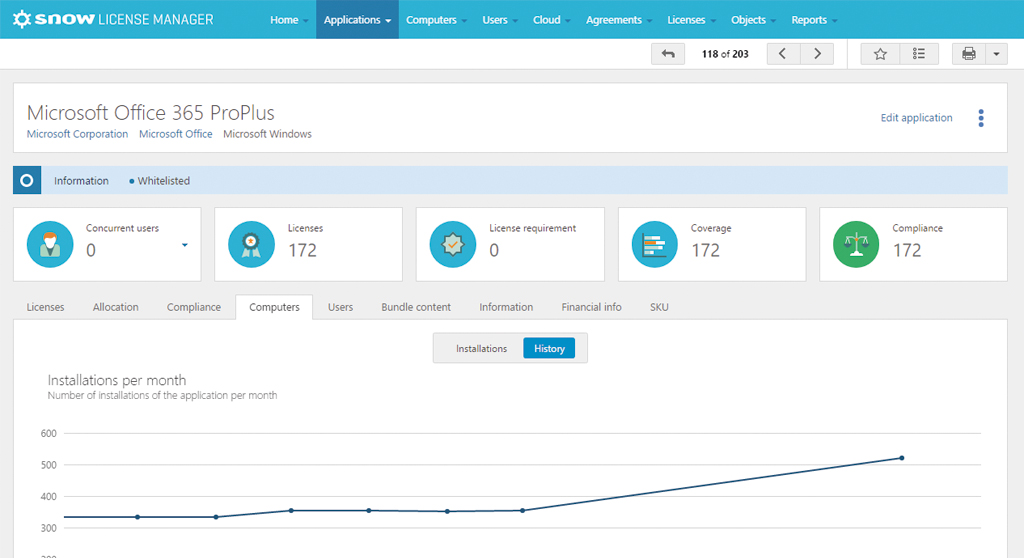
Thankfully, my colleagues in the R&D team at Snow agree. They put thousands of hours work into our user interfaces every year, making them both easy to use and incredibly powerful in terms of quickly conveying important information.
Our users agree. Talking to customers, I hear the same compliments repeatedly. When evaluating Snow against competitors, our user interface really stands out.

For a start, it is a true multi-user platform, designed to accommodate authorized stakeholders from across the organization simultaneously accessing, editing and reporting on a common data set (a data set that is itself collated from multiple sources). Not only is it multi-user, but dashboards can be easily built and customized to meet the specific needs of whoever is accessing the data, from the CFO to procurement manager, CIO to the SAM professional. And all that customization can be achieved without learning a single line of code – it’s all just drag and drop with a touch of filtering.
It’s also responsive, which means that it works equally well on a PC, laptop or tablet – and can even be used effectively on a mobile phone without the need for a dedicated mobile app. With more people accessing applications on their mobile devices, there is an expectation of a consistent user experience and access to all functionality regardless device type.
The way the screens, graphs and tables build is also dynamic, further improving the user experience.
But it’s not just the fancy stuff. The way the dashboards are laid-out and information is prioritized on-screen is the result of hundreds of hours of research, testing and user focus groups. To a large extent, it’s a Software Asset Management solution built for SAM professionals by SAM professionals.
And we’re by no means finished. There is exciting work going on right now that I can’t yet talk about. Except to say it’s focused on continuing the trend of making better and more relevant information available to more stakeholders in a highly customizable and pliable format.
And who knows, maybe KITT wasn’t as far-fetched as we might imagine. After all, we have Siri, Cortana and Alexa now. Who’s to say that Software Asset Management intelligence might not soon be a voice command away?
To see the results of Snow’s investment in user experience, why not take a test drive of the Snow SAM platform yourself?